
At each WWDC keynote, you have the software — and then you have the show itself.
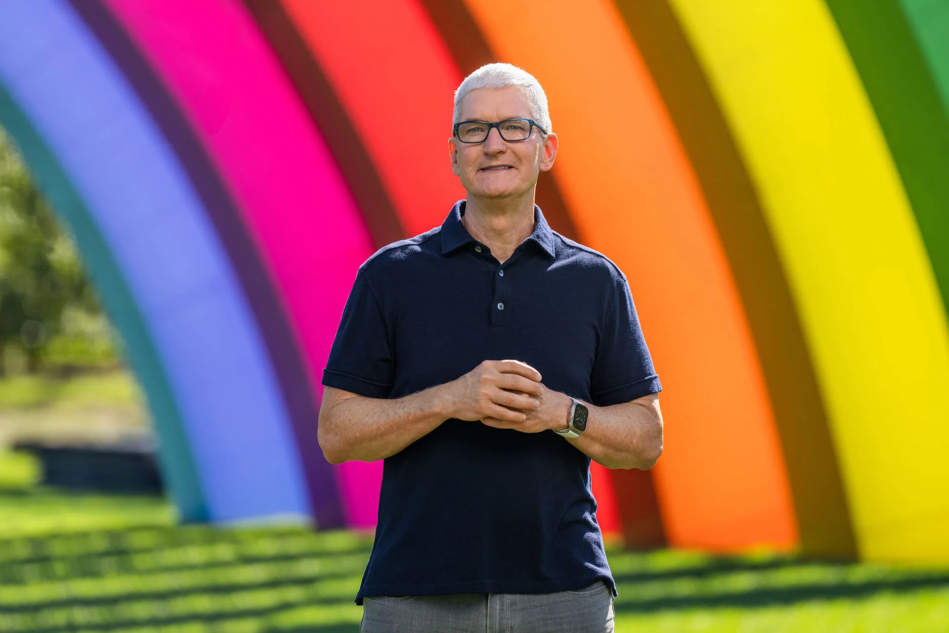
And if you’ve seen enough of them (or all of them, as many of you probably have), you’ll recognize the rhythm: a sweeping drone shot of Apple Park, Tim Cook out on a balcony with some big-picture observations, followed by Craig Federighi appearing to kick open the platform parade: iOS, iPadOS, macOS, watchOS, and now visionOS.
Each takes its turn, each receives its applause, and each finds its place seamlessly in Apple’s immaculate grip. It’s a reliable blueprint that’s worked for over a decade. It’s predictable, efficient, and entirely within Apple’s control (even more so in this pre-recorded era). For those of us in media, it also makes our lives easier as we know how to structure coverage and hand out writing assignments. And yet this year is different. And I don’t believe Apple will, or should, play from the same playbook.
In fact, I hope that they don’t.
WWDC 2025 is unfolding as Apple’s most visually cohesive software rotation in years. For the first time, all the big platforms are going to be redesigned at once with a shared design direction, the beginning of Apple’s glass age (codenamed Solarium internally). It’s a system reportedly defined by translucency, depth, and motion, and a design language that visually ties together the iPhone in your pocket, the Mac on your desk, and the watch on your wrist.
Historically, Apple launched redesigns platform by platform:
- iOS 7 (2013) – the era of flatness
- macOS Big Sur (2020) – iOS-ifying the Mac
- watchOS 10 (2023) – a card-based reimagining of navigation
Each got its spotlight. iOS 7 had a beautifully narrated Jony Ive video to frame the shift away from skeuomorphism. Big Sur was introduced with equal weight, but only for the Mac. Each had its own spotlight, each its own philosophy. But this year, Apple faces a storytelling challenge: how to present one design philosophy that spans all of them.
A Different Opening Act
Prediction: Apple opens WWDC 2025 with one design presentation, from Vice President of Human Interface Design Alan Dye, not Craig and iOS 26. Dye unveils Liquid Glass as an overall ecosystem-wide identity: one language, tailored to each screen. If WWDC last year was the start of the Apple Intelligence era, this year marks the start of the Liquid Glass era.
If you’re looking for precedent, you’ll recall Dye’s unveiling of the Dynamic Island at the iPhone 14 Pro launch in 2023. He wasn’t selling it as a feature; he showed it to you as philosophy — “hardware and software built together, so you don’t know where one begins and the other ends.” Expect the same tone on Monday: not a simple demo reel, but an argument about how design, emotion, and function intersect in Apple’s world.
“This year, we’re entering a new era of Apple design — a visual evolution across every Apple device our users love. It begins with Liquid Glass.”
Then a cinematic montage of iPhone, Mac, iPad, and Watch, all refracting the same design language. That’s the context Craig can build on when he steps in and walks us through each platform at a time.
Why It Matters
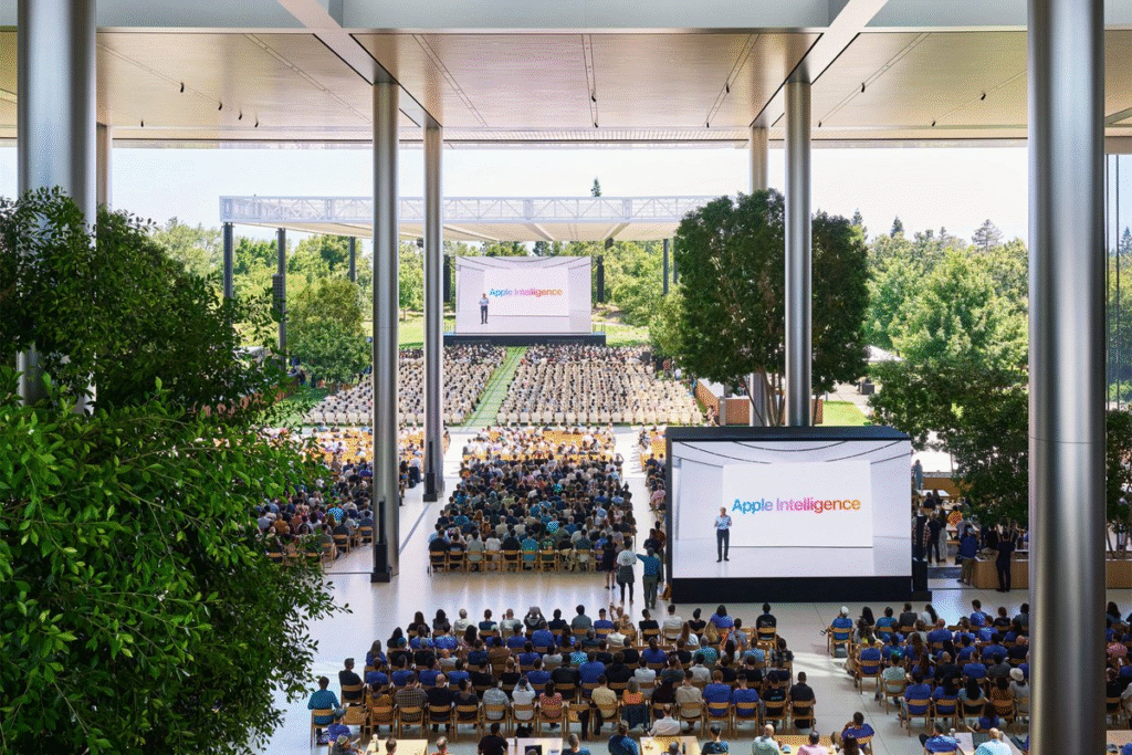
WWDC isn’t just where Apple shows new software (and the rare hardware sneak peek), it’s where Apple frames its future and where we get a sense of where the company’s top brass’ priorities are. Developers take cues from how features are prioritized. The press takes narrative direction from how segments are ordered. And users, even if subconsciously, form impressions based on what feels emphasized.
If Apple presents this year’s redesign as six disconnected updates, it loses the story. And cohesion is the very reason this redesign exists in the first place. But if Apple opens with a unified reveal and if it leads with “why” before getting to “what,” it reframes the entire keynote.
It also solves a human problem: fatigue. With six platforms to cover and growing complexity in each, the keynote risks becoming bloated and repetitive. Add the Apple Intelligence shortcomings to the mix, and the message can easily get lost before Cook even says, “Have a great WWDC.” A single, high-level design segment at the top gives the event momentum. It offers narrative clarity before the keynote splinters into product lanes.
Why Now?
Design has always been Apple’s way of signaling long-term intent for each platform’s respective hardware family.
- iOS 7 signaled a reset that would lead iOS and iPhone hardware design for the next decade.
- macOS Big Sur wasn’t just rounded corners and the iOSification of macOS; it was about building the foundation for the Mac’s Apple silicon era.
- Dynamic Island offered a unique hardware + software experience exclusive to the latest iPhones and a whole new form of interaction.
This year, the unified design shift can carry similar weight, but only if Apple frames it that way. Reporting from Bloomberg suggests that the 2027 iPhone, aka the 20th anniversary iPhone, is in large part an inspiration behind this design shift for iOS 26.
That 20th anniversary iPhone will expand on the glass concept. It will have curved glass sides around the entire phone, even at the edges. There will be extraordinarily slim bezels and no cutout section in the screen. Inside Apple, the 2027 iPhone is called the “Glasswing,” in reference to the type of butterfly that has transparent wings.
Bloomberg’s Mark Gurman
A visual refresh across all platforms is one of the clearest ways Apple can say: We’re still evolving. We still care about how things feel. And we still think deeply about design.
But that message gets lost if it’s buried 20 minutes into the iOS section. Apple knows how to control a story. If there was ever a moment where Apple needed to take back control of the narrative, it’s now. Thankfully, we only have a few more hours until we find out.