It’s been less than 24 hours since we all watched the WWDC 2025 keynote and the reveal of the Liquid Glass Apple design, ending with an iconic musical of “real” App Store reviews (here’s a link to it).
One thing to miss from the fully in-person keynotes is the audience erupting in applause or gasping in horror (hard to tell which one would have transpired if Liquid Glass debuted on stage in the pre-2020 era), but in several instances throughout yesterday’s keynote, you could hear the “virtual” applause. While the applause may have been virtual, the accompanying feelings were real, raw, and unfiltered. After months of rumors, speculation, and narrative framing from Bloomberg, Apple’s Liquid Glass design language is finally here, and I’m still wrapping my head around it.
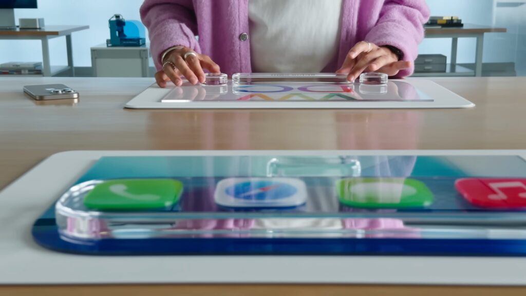
Two days ago, I wrote that I was cautiously optimistic and concerned heading into this year’s WWDC. My concern originated from knowing that we would be getting a redesign from the same team of designers that gave us the original macOS Big Sur battery icon and a controversial Photos app redesign last year.
Now, 24ish hours after the keynote, what I feel is a mix of awe, appreciation, and something more hesitant. Before moving on, it’s important to remember that while we often critique “Apple,” what we saw yesterday was the result of real work by real people. Posts of Apple employees expressing their excitement about finally being able to share what they’ve been working on prove it. Designers, human user interface experts, developers, and engineers poured time, care, and craft into every detail.
Any criticism, if warranted, should be directed at the broader direction and execution, not at individual ideas or the effort behind them. It’s easy to dismiss a feature as misguided. It’s harder and fairer to recognize the complexity and intent behind it.
Because Liquid Glass, in its ambition and scope, is breathtaking. It’s the most visually cohesive Apple update we’ve ever seen. But in its current form, raw and experimental in iOS, iPadOS, macOS, watchOS, and tvOS 26, it also risks being more of a hallucination of what could be a transformative era of UI design rather than a final destination. I feel like we’re seeing something Apple has long been hesitant to show: a raw, ambitious, unfinished dream.

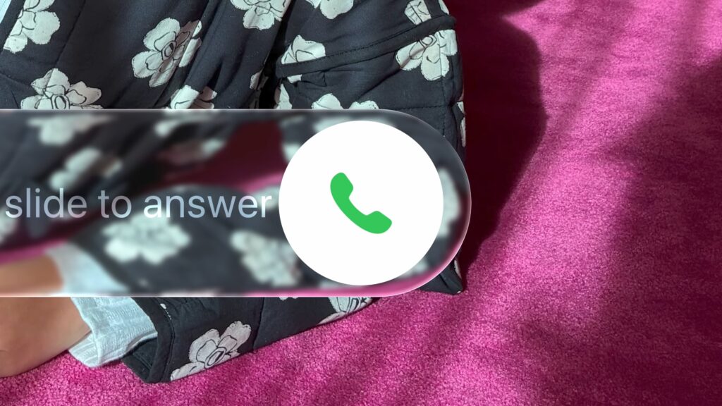
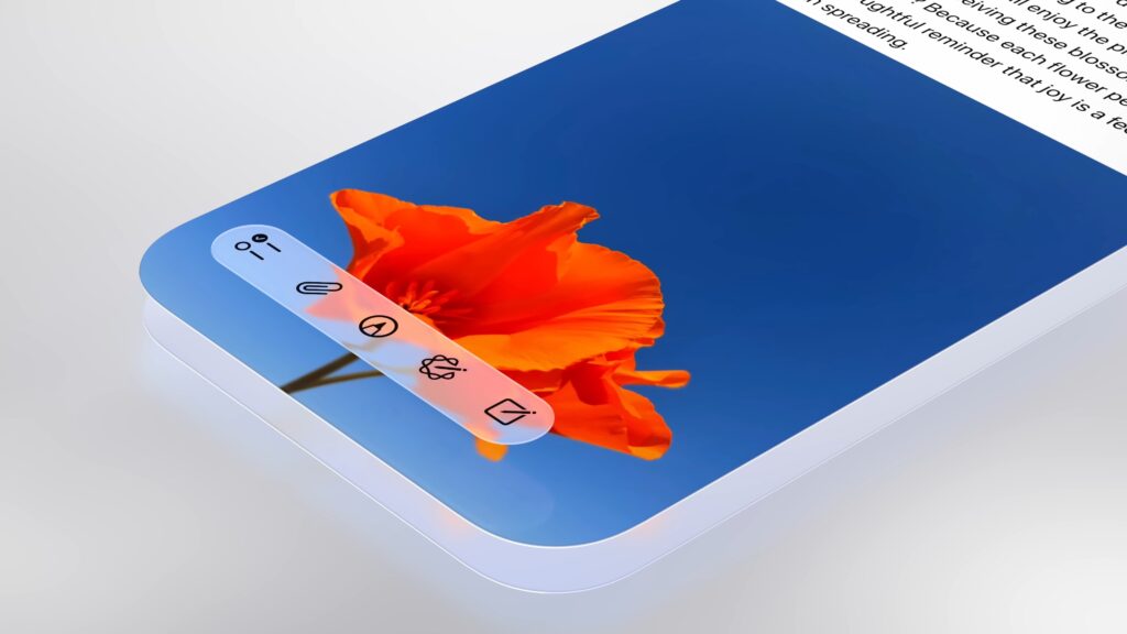
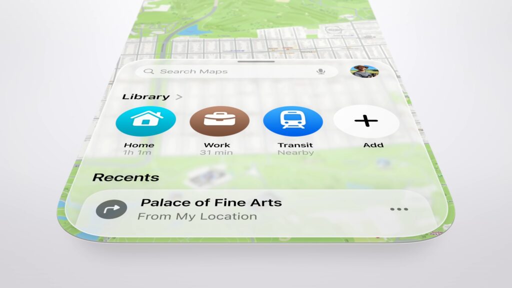
This article isn’t a definitive review because it can’t be. The software is far too fresh to jump to any judgment. But this is the beginning of a conversation. The first beta of iOS 26 is, as expected, rough. UI glitches, lag, and layering inconsistencies make it clear this is far beyond a work in progress. But despite the bugginess of the beta, you can start to see the silhouette of Apple’s vision. What follows is my early, personal take on that vision.
The Genesis of Liquid Glass
Liquid Glass didn’t arrive in a vacuum. Its roots are tangled deep in the philosophy behind Vision Pro’s interface. A spatial, depth-filled canvas where UI elements feel airy and alive, and are inspired by the materials our products are made of. To anyone who watches and pays attention, the moment we got a glimpse of visionOS and Apple’s first dip in the waters of spatial 3D design at WWDC 2023, we could all see where it would eventually be heading.
/Across iOS 26, iPadOS 26, macOS Tahoe 26, watchOS 26, and tvOS 26 (it will take me a bit of time to get used to typing all that), Apple has introduced a design system that lives somewhere between translucency and tactility. Apple’s hardware, famously, has a sense of uniformity. The corner radius of the iPhone, for example, matches that of the Mac and iPad. Apple’s hardware has had a birthmark. Now, all of its software finally does too.
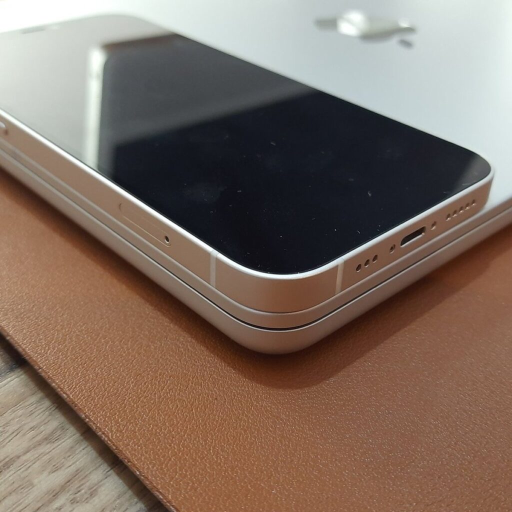
That software birthmark is fluid and deeply expressive, and right now, undeniably a mess. But it’s a mess I admire.
Control Center looks like a screenshot pulled straight from a 2018 jailbroken iPhone. The kind of visual chaos that would have sent someone on Craig or Alan Dye’s team into cardiac arrest. Notification legibility on the Lock Screen is somehow so erratic that at this point, it’s interpretive art.
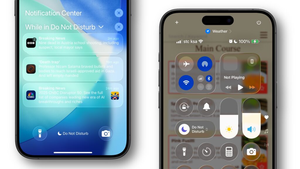
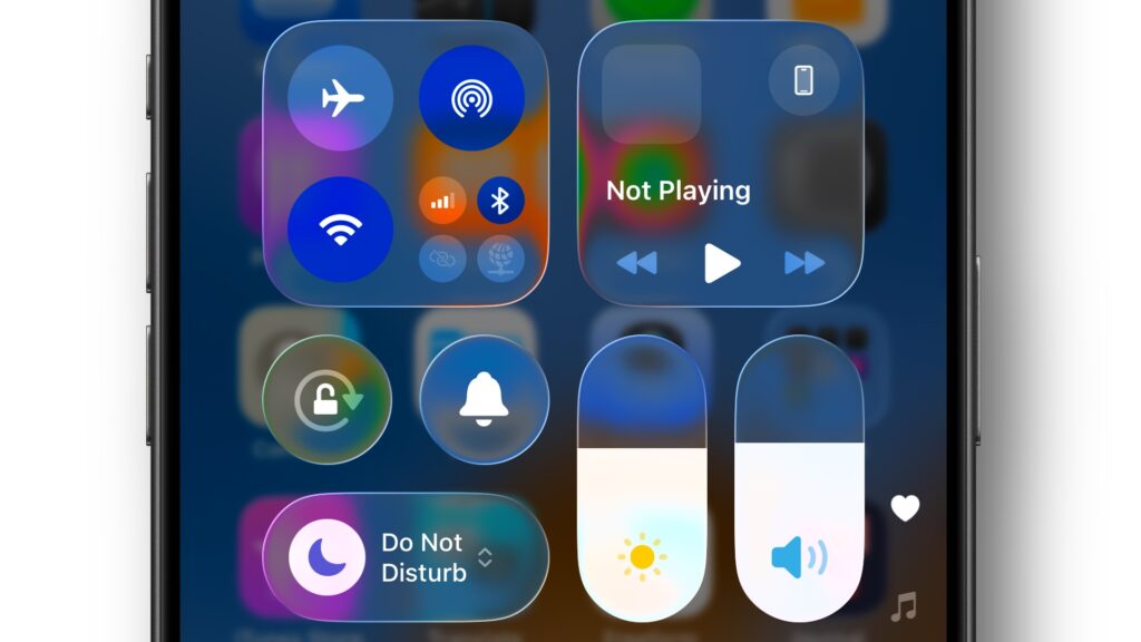
Take Control Center. In iOS 26, Apple retains the modular, page-derived customizable layout from iOS 18 but overlays it with aggressive transparency. The background blur has also been significantly reduced, and the control center modules themselves adopt a glassy look, which, depending on your wallpaper, could allow so much content to shine through that readability suffers. It’s definitely what isn’t shipping come this fall.
The Music app got one of the biggest facelifts of the keynote. The new design and how the floating tab bar beautifully refracts the music art behind it are stunning. Swiping across different sections of the tab creates a fluid, almost bubbly-like motion, with Apple Music elements responding like droplets shifting under the glass.
This is Apple applying the lessons of Dynamic Island in a core app: UI that breathes, stretches, and morphs depending on context and user intent. It’s a delight, and one of the clearest expressions yet that Liquid Glass is more than a visual theme but a new way of designing movement and depth.
iOS 15 beta 1 through 5 called — and they want an apology from all of us. In Safari, Apple has resurrected the controversial floating tab bar design it first introduced, then quickly walked back, in 2021. Back then, the minimal bottom-aligned design sparked enough backlash from this very community to trigger a rollback. I was one of the few who hoped it would return (1,2).
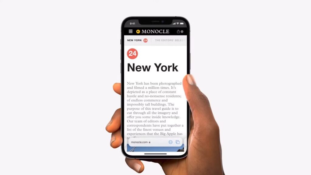
Now, four years later, it’s back, and it finally makes sense. Within the context of Liquid Glass, the floating Safari bar feels more native and more deliberate. The address field sits in the center, flanked by a prominent return button on the left and an option to expand basic Safari controls on the right.
One part that stood out to me was during iPadOS 26’s section. When Craig handed it off to Cindy Barrett, Manager of System Experience Engineering, to demo the new windowing system, she prefaced it by saying that, despite the new changes in iPadOS 26, users who love using the iPad simply as an iPad still can.
“This rearchitected and redesigned windowing system maintains the simplicity of iPad. When I first open an app, it shows up full screen. I can swipe home and open another and it’s still full screen. So if this is how you like to use iPad it’s just as simple as ever.”
The message was clear: we’re adding capabilities to the iPad for those who want it, but not removing the simplicity and ease of use that makes the iPad an iPad for anyone, whether a developer or a grandma using it to connect with her grandchildren.
That same thinking has governed many of Apple’s recent decisions. Craig’s team has relinquished control over design elements of iOS over the years, while still allowing the core, untouched, “stock” experience to remain the same. If you want to go all-out and customize your iPhone to the max, you can, and you’ll have the power too. If you want to use it as-is out of the box, you can and will have a perfectly enjoyable experience.
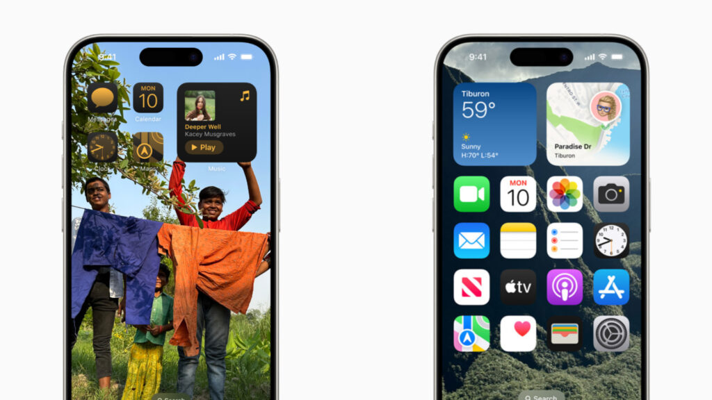
That trend is furthered with iOS 26 with the Lock Screen and Home Screen. Changing either interface is a risk. Those two interfaces are the faces of the iPhone, and any change to either risks damaging the core characteristics of iPhone design (Craig also talked about this at The Talk Show in WWDC 2024. Link timestamped).
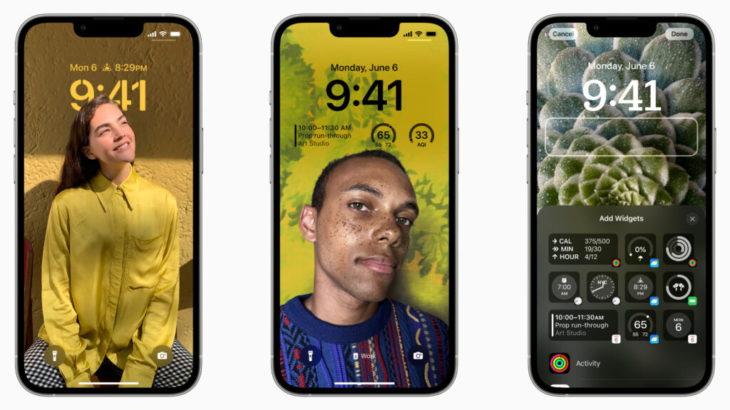
When Apple introduced the redesigned Lock Screen in iOS 16, it pushed the boundaries without crossing the line. Even fully customized, an iOS 16 Lock Screen still looked unmistakably like an iPhone. With iOS 18, Apple uncomfortably tiptoed even closer to that line by allowing app icon tinting and layout freedom on the Home Screen.
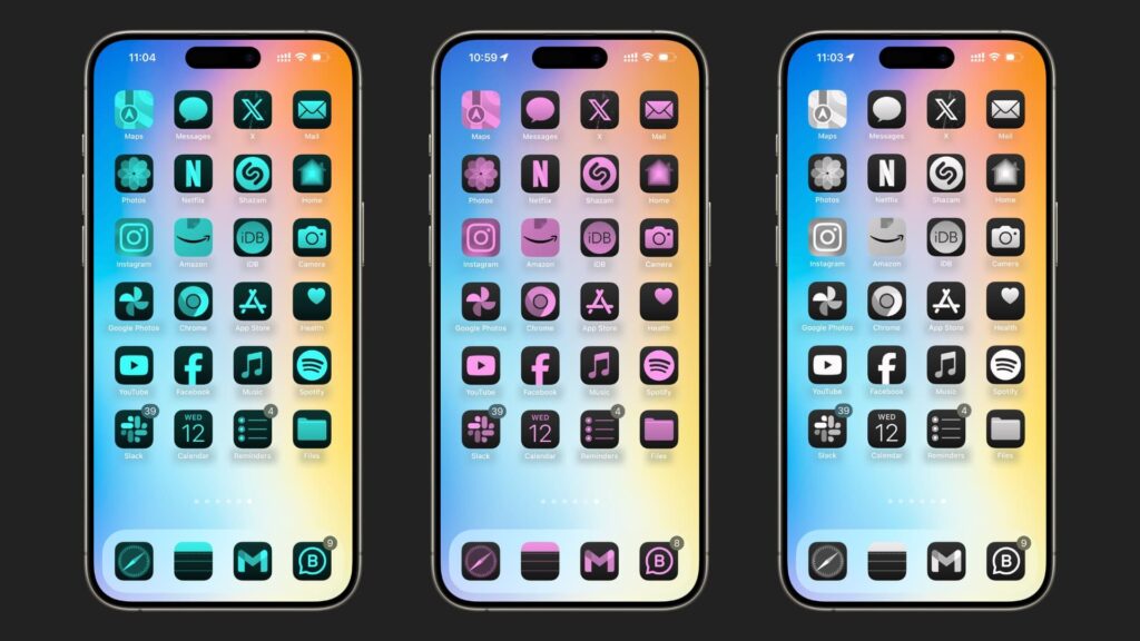
Yet even for a hardcore user who pushes it to the max with a customized Home Screen, it still retains the essential visual identity of iOS. That restraint matters, and so far, Apple seems to understand just how thin the line is between evolution, user freedom in how their device looks and feels, and damaging a very carefully crafted iPhone visual identity.
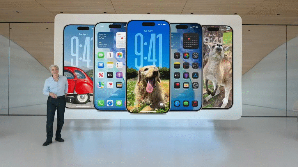
In iOS 26, both the Lock Screen and Home Screen have been reimagined to reflect Liquid Glass. On the Lock Screen, you can now stretch the clock vertically to fill in space behind a subject in a wallpaper. Widgets can also be repositioned to the bottom of the screen, right above the shortcuts, allowing for a more balanced and legible layout depending on your wallpaper.
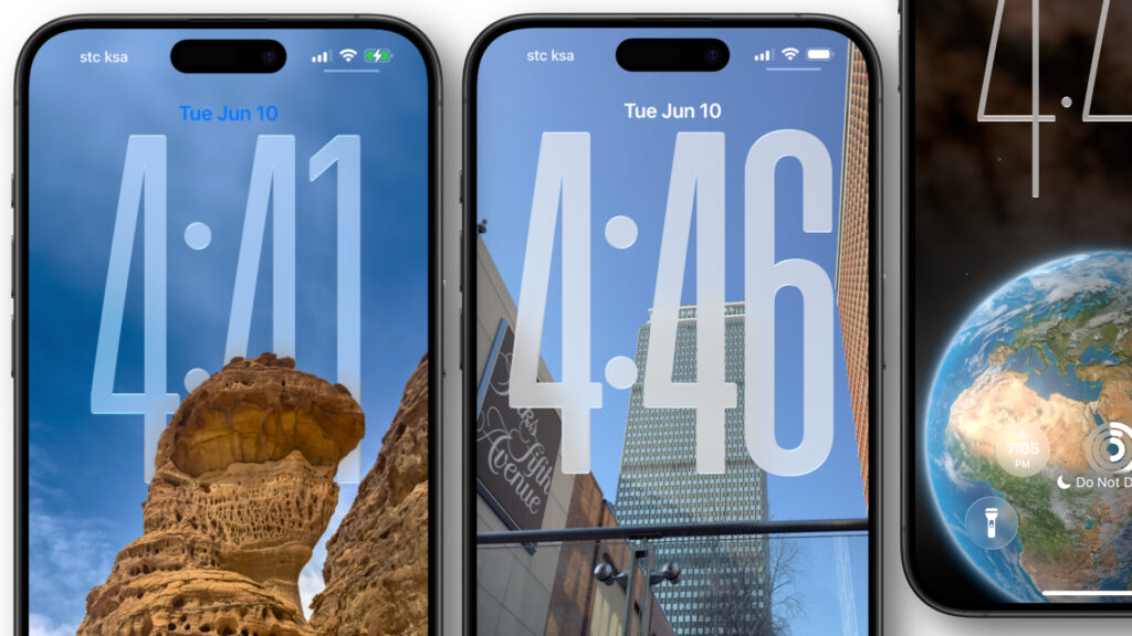
The Home Screen, meanwhile, introduces a new “Clear” mode for app icons and widgets. As the name suggests, this mode turns everything translucent, allowing the colors and depth of your wallpaper to shine through.
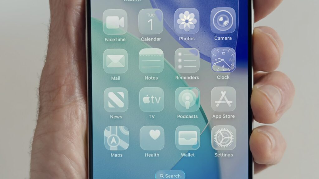
Over on the Mac side, Apple is once again inviting a familiar round of speculation that Federighi may need to swat away with another emphatic “NO” in font size 2,000. Everything is more rounded now in macOS Tahoe. Not just subtly rounded, but dramatically softened in a way that feels almost tailor-made for, dare I say it, a touchscreen Mac.
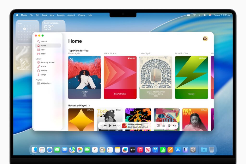
Like iOS 26, macOS Tahoe introduces the new Clear mode, bringing that same layered translucency and depth to the dock and widgets on your desktop. Spotlight, something on no one’s bingo card, has been turbocharged to the max for productivity. Typing this on the macOS Tahoe beta and already Spotlight is one of my favorite features this year.
With the simple act of swiping down from the Home Screen, you notice how the layered Lock Screen reacts with the icons behind it, refracting like light through real glass, bending and warping as if the interface had depth and texture. It’s a level and attention to detail that’s worthy of praise. It’s a beautiful design implementation rendered in real-time. I find myself just admiring toolbars and drop-down menus, something I never expected to say.
All of these aren’t examples of skeuomorphism. Nor are they showpieces of minimalism. Apple has always understood the power of design as narrative, as I outlined in my piece from earlier in the week. From the stitched-leather skeuomorphism of early iOS to the neon-flat minimalism of iOS 7, each design shift has telegraphed a larger message: that the future isn’t just functional and filled to the brim with gen-AI features, it’s emotional.
Even reading through the post-keynote coverage as everyone slowly got their hands on the betas (side note: it was awesome to sit back and just watch the damn keynote without breaking my keyboard), I kept noticing a recurring word: feel.
“It feels more fluid.”
“I feel like it’s more responsive.”
“This feels different.”
And that, I argue, is the entire point. Liquid Glass is a design language built not just to be seen, but felt. It doesn’t merely react to user input. It responds. Tap a button, and the light refracts. Slide your finger across a control, and the interface breathes and comes alive in some weird sense of the word alive.
It’s Apple in its most visually expressive form yet. An ethos that embraces emotion. When you step back and ignore Apple’s beautifully animated animations and marketing material, you begin to appreciate that there’s a kind of theater to it. Unlike the cartoonish feel of Google’s new “Material 3 Expressive” design language or the pixelated glyph interface of Nothing OS, Apple’s new design feels dynamic, expressive, and unapologetically visual. Apple calls it their “broadest design update ever.” And for once, the hyperbole fits.
It feels… modern. Not in the tech-bro minimalism sense, but modern as in fluid. Apple is preparing us for a future where UI exists in the environment, not constrained to rectangles. Whether that’s AR glasses or the Glasswing iPhone in 2027, this design is part of the bridge.
The Culture of the First Beta
Every year, a familiar cycle unfolds: the keynote ends, the first developer beta drops, and within hours, screenshots are flying, hot takes are everywhere, and all of a sudden everyone knows better than designers at the world’s largest company. Some of it is thoughtful feedback. Much of it is reactionary. And none of it tells the full story.
It’s important to remember that Apple’s first betas, by definition of being “beta,” are not meant to be polished. Think of betas like the scaffolding, not the skyscraper. But we’ve built a culture around treating these betas like final verdicts. We circulate blurry screenshots of unfinished iOS features and make sweeping judgments about intent, direction, and failure.
This isn’t about giving Apple the benefit of the doubt, it’s about understanding the stakes and scale of what we’re seeing with Liquid Glass. Liquid Glass, evidenced by Alan Dye’s introduction and the subsequent marketing of it, is a system, not a skin that’s being thrown on top of what existed.
The truth is that we’ve been asking Apple to take a bold jump with the iOS design and have, dare I say it, courage, but when it finally does what we’ve been asking it to do for years, we judge the messiness of the first step instead of the clarity of the direction. That doesn’t mean we shouldn’t criticize. I’ll be the first to call Liquid Glass a mess of user interface design if the current iteration of it ships in the fall. But we also need to recognize that criticism, at this stage, should be about long-term potential, not short-term perfection.
Cultural and Competitive Context
A lot has been said about Apple being behind in AI. As I called it in my piece on Sunday, market-focused news outlets from CNBC to CNN labeled WWDC 2025 as a lackluster event for Apple in AI. I question if they watched the same keynote I saw. If WWDC 2025 proved anything, it’s that Apple isn’t behind in AI; it’s just telling a different story from a book no one is bothering to read.
While Google pushes forward with shoving Gemini into every crease and crevice of the internet, and Samsung simultaneously doubles down on “Ultra” foldable, Apple’s big swing this year is design.
Liquid Glass may not talk back to you or be able to walk you through how to repair a bike, but it reshapes how we interact with our devices, how apps express themselves, and how your devices feel in your hand, on your wrist, or on your face. And it’s only a matter of time before Samsung itself, and the rest of the Android market, discover glass and introduce “Fluid Glass” or some rip-off name.
What Liquid Glass shows is that Apple still believes deeply in design. At a time when the rest of the industry emphasizes AI features and raw functionality, Apple is putting aesthetics, consistency, and delight at the forefront.
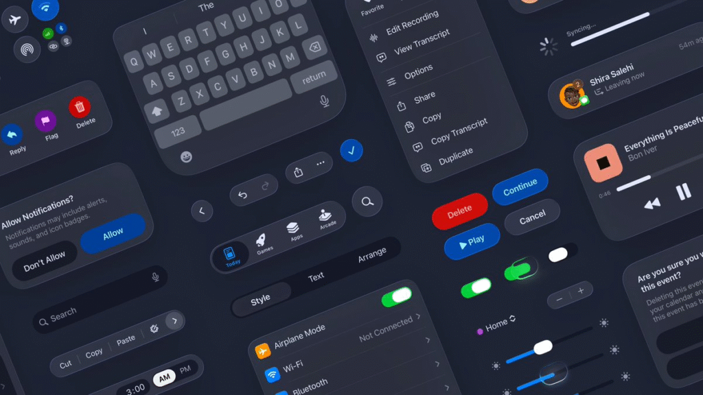
It’s a cultural stance that says how something feels matters as much, if not more, than what it does. Apple is showing us it believes that the interface through which we access intelligence is just as important as the intelligence itself.
Having said that, this moment demands clarity. Unfortunately, it’s clarity we’ll only get in a couple of years when we’re well on this Liquid Glass journey, which I predict we’ll hit our stride by iOS 29. The industry won’t stop focusing on AI and functionality simply because Apple’s main narrative isn’t that. AI will continue to dazzle and amaze us. The challenge for Cupertino is that it now has to prove that it can lead on both fronts. Design can’t become a shield Apple hides behind to excuse stagnation.
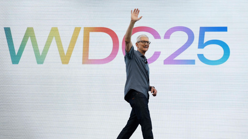
Of course, there are real critiques. Some say Apple is focusing too much on looks. That Liquid Glass is just a facelift. But I think that misses the point. Design, for Apple, is functionality. And this redesign is part of a bigger narrative that combines design and intelligence in a new harmony.
The Road Ahead
Liquid Glass will evolve and morph just like the glass itself. When Apple commits to a design language at this scale, it does so with the long game in mind. Nothing about this feels rushed or arbitrary. Liquid Glass is meant to stick around, and while the first step might be messy, that’s not unusual for Apple. It’s easy to criticize early betas, but foolish to underestimate a company that’s made a habit of proving skeptics wrong. Including myself.
I am, for one, incredibly glad that Apple has loudly stated not just that it still cares about design, but that it’s finally willing to take risks again after playing it safe for far too long. Liquid Glass is no doubt a big gamble. One that dares to prioritize elegance in a world obsessed with efficiency.
I don’t think Liquid Glass will be remembered as a gimmick. I think it will be remembered as the first step in Apple’s next interface journey and a bridge between the physical devices we carry and wear and the environments we live in.
It’s not perfect. But I’d rather Apple chase something beautiful and unfinished than play it safe with the expected, especially at a time when questions on the company’s future linger. There’s something special here. I just hope Apple gives it the attention it needs to shine.
In the meantime, I’ll be over here — swiping through glass.


Pingback: Apple Questions Itself in iOS 26.1 Beta 4 – Cupertino Lens
very interesting topic, outstanding post.
Pingback: Apple’s $1B Gemini Deal to Rebuild Siri – Cupertino Lens
Simply a smiling visitor here to share the love (:, btw outstanding design.
Pingback: Amber Alert at Apple: Executive Turmoil and AI Strain – Cupertino Lens