
Historical note — reviewed August 8, 2026: This essay was published on August 25, 2022, before Apple’s September 7 “Far Out” event. In hindsight, the cosmic artwork aligned with Emergency SOS via satellite across the iPhone 14 lineup; Apple launched the service in the US and Canada on November 15, 2022. The invitation itself did not confirm the feature, and the original pre-event speculation is preserved below.
“What does Apple have planned for space? Space is an increasingly important field. It won’t make its own rockets, but surely it has some plans, no?” That’s what I tweeted back in July 2021, and Apple’s iPhone 14 event later supplied one answer: Emergency SOS via satellite.
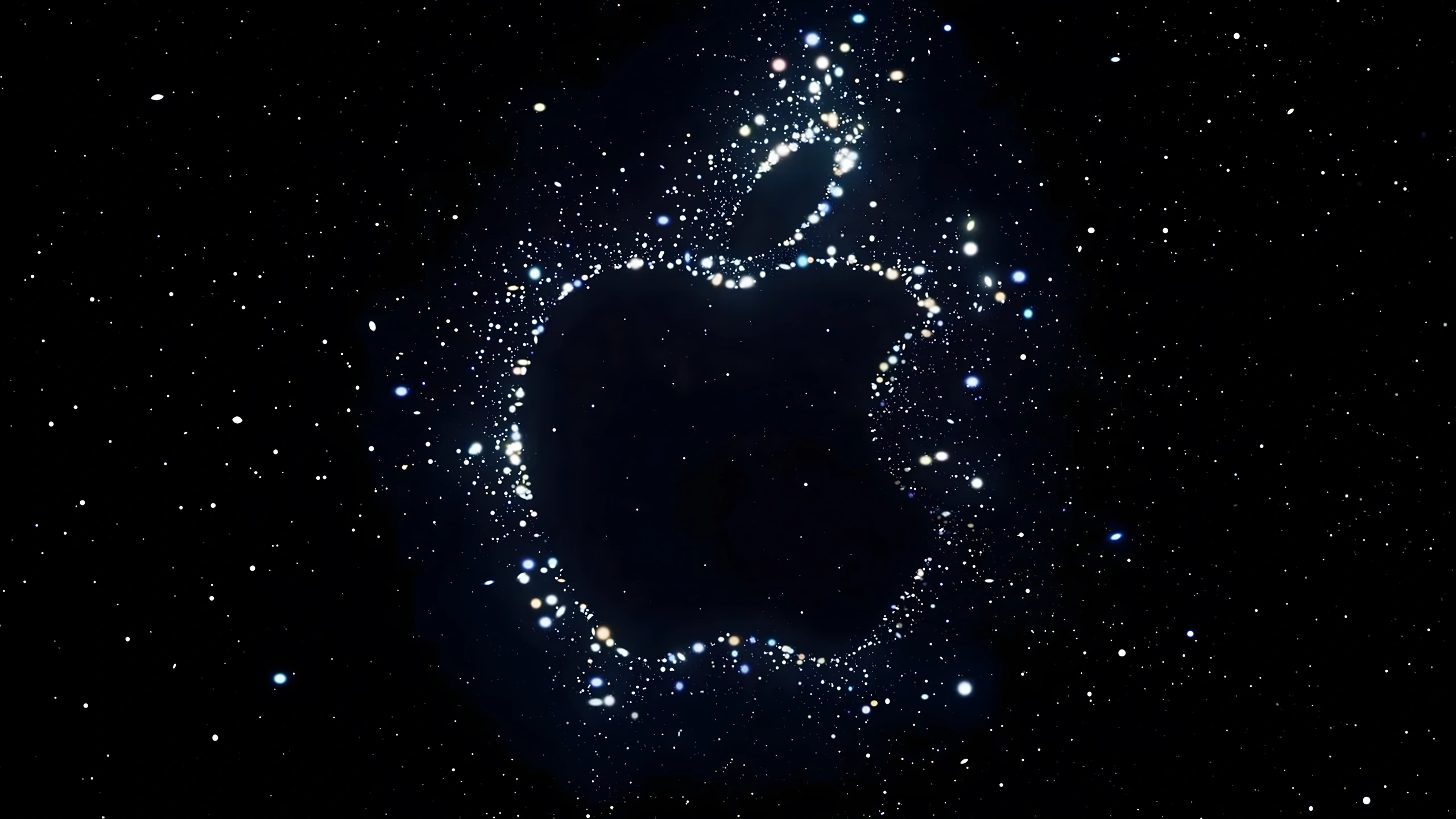
Apple’s September 7 “Far Out” artwork leaned entirely toward space: stars everywhere, the tagline itself, even the “Go for launch” phrasing on Twitter. Mark Gurman suggested “Far Out” referred to how early Apple sent out the invites. Normally they arrive a week before; this time, they went out much earlier. A smart play on Apple’s part: both far out in timing and far out into space.
But it’s important to remember one thing: Apple is not stupid. People love reading into its invites for hidden meanings, and Apple knows it. Apple is fully aware of the hype these artworks create. It knows the rumors, the speculation, the frame-by-frame analyses. And because it knows that, it likes to have some fun.
After the event, it’s always easier to look back and decide what Apple was trying to say. More often than not, it wasn’t much. Let’s look at a few examples.
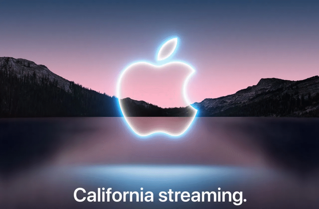
Apple logo with neon lights? Pink-and-blue sky, so maybe a new bronze color? Astrophotography?
Nope. None of it. Aside from a faint hint at the new Sierra Blue, the “California Streaming” invite for the September 2021 event meant nothing beyond providing the backdrop for a few video transitions. That said, the “California Streaming” tagline was a clever bridge — a reference both to the all-digital format and to how Apple filmed presenters across the state. It also introduced one of the most memorable keynote openings Apple has ever done.
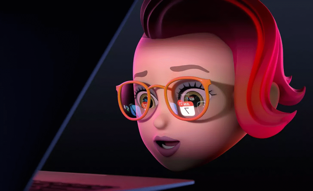
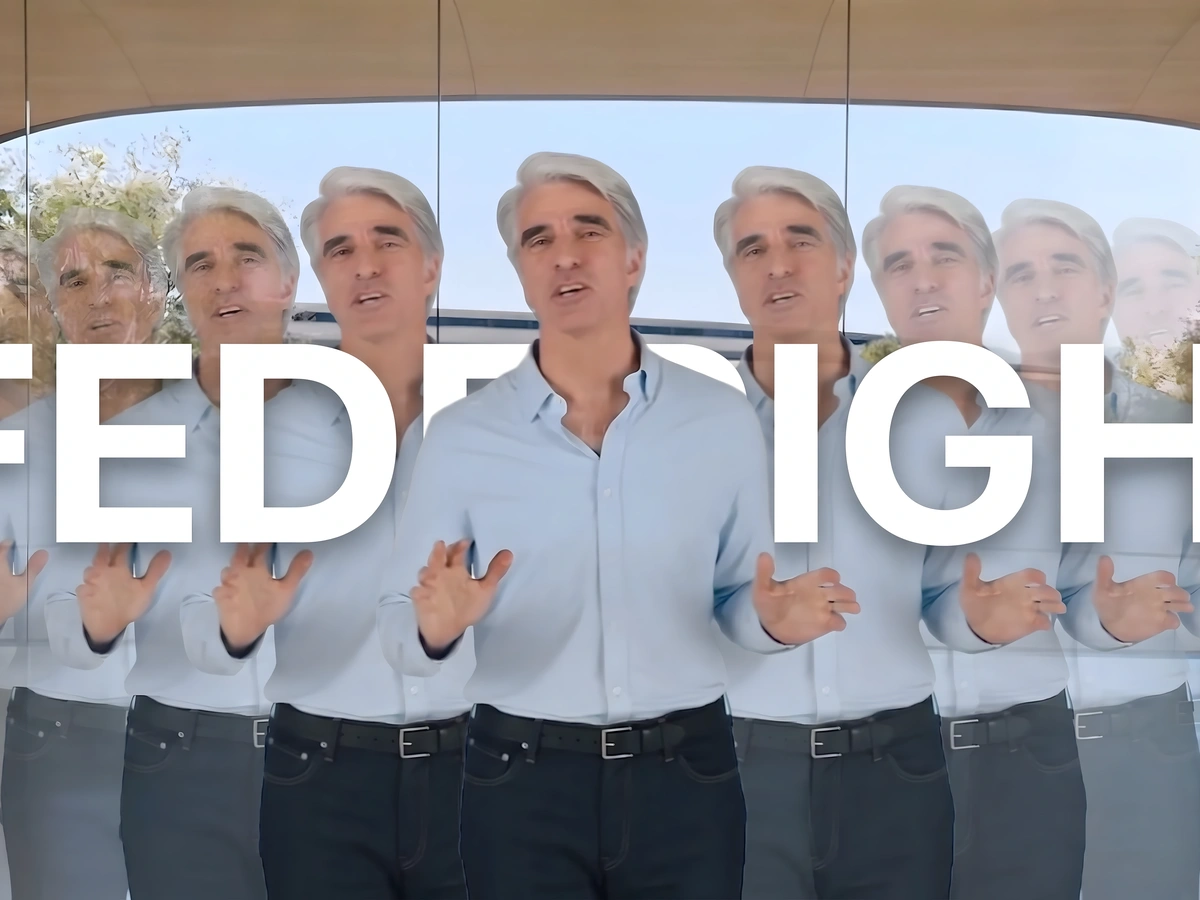
My favorite example, though, is WWDC. Since 2020, Apple has used the same Memoji-style heads on its invites. It was cool at first, but it’s starting to wear thin. The WWDC 2021 artwork sparked some serious speculation with many people oddly concluding that it teased Apple’s long-rumored AR glasses. It didn’t. It was just a fun callback to Craig Federighi’s “let’s set the mood” moment from the Apple Silicon reveal in 2020.
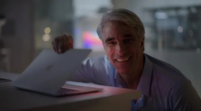
Another example is WWDC 2020.

If you zoom in on the right pair of glasses, the reflected code translates to:
u{1F374} = 🍴
u{1F634} = 😴
u{1F4BB} = 💻
Everyone (myself included) assumed that the laptop emoji followed by “while true” confirmed new Macs were coming (this was during the hype for the 14-inch and 16-inch MacBook Pros). Unsurprisingly, it was just a wink from Apple to the sleepless developers eating ramen in front of their Macs.
These invites do have meaning, but rarely in the way people expect. Especially during the digital-event era, they’re more about tone than spoilers, dictating the wallpaper aesthetic, the color palette, and the event’s transitions. So yes, the stars could have meant astrophotography or satellite connectivity (and, to be fair, we did get the latter), but most of the time, reading too deeply into it is just part of the fun.