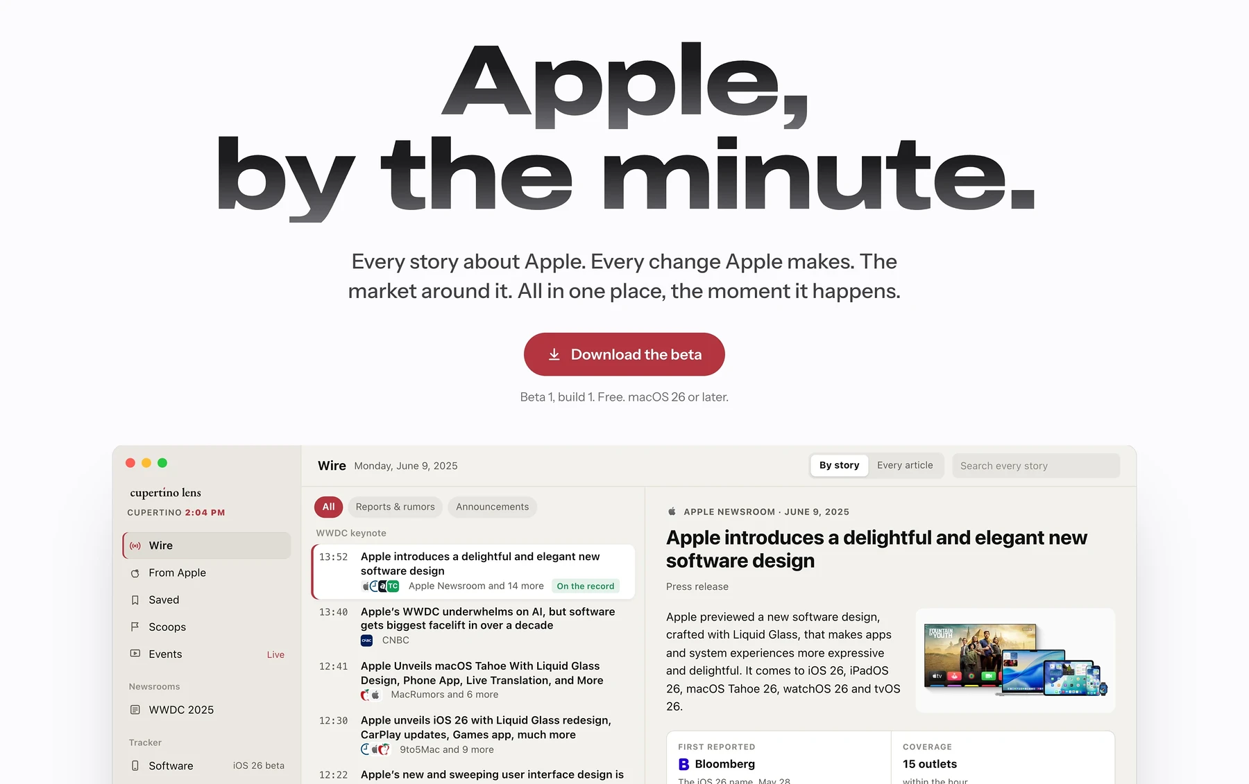
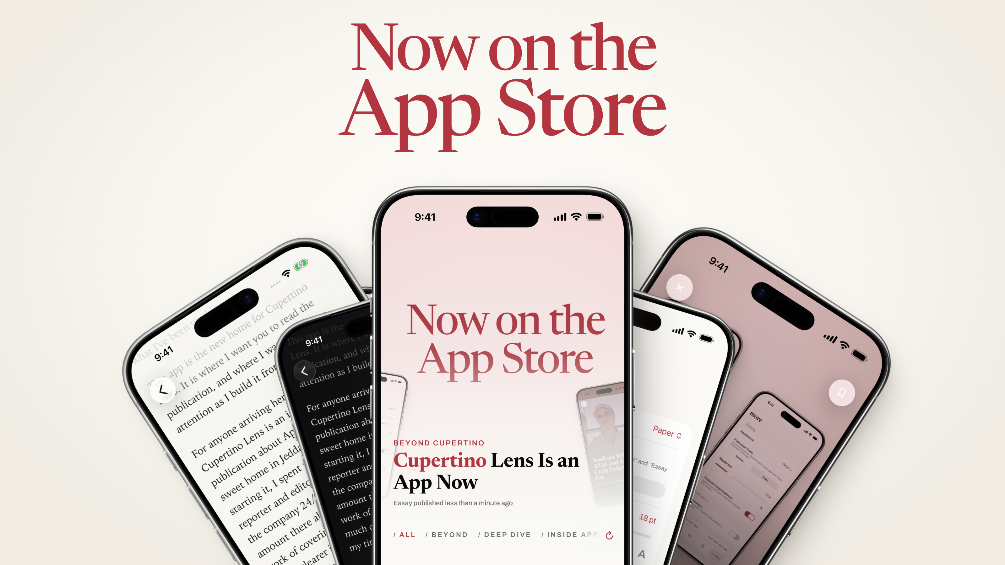
The Cupertino Lens app is on the App Store. It took three months to design and build, and then a further stretch of weeks spent convincing Apple that a publication writing about Apple was allowed to exist on Apple’s store. I have a fair amount to say about that. First, though, I want to show you what I’ve been working on.
This app is the new home for Cupertino Lens. It is where I want you to read the publication, and where I want to put my attention as I build it from here.
Why Cupertino Lens Needed an App
For anyone arriving here without context: Cupertino Lens is an independent publication about Apple, written from home sweet home in Jeddah, Saudi Arabia. Before starting it, I spent two years as a news reporter and editor at MacRumors, covering the company 24/7. I learned an enormous amount there about Apple and about the work of covering it. I also came away with a much clearer idea of what I wanted to spend my time writing.
So much of mainstream Apple coverage revolves around getting the next headline out, breaking the next story, having the exclusive, and keeping the views and engagement coming. I understand that world. I worked in it. But I kept wanting to stay with a subject after the news had moved on. Why did Apple make that decision? What does it tell us about the people running the company? How does it fit with something Apple did five years ago, or something it keeps promising to do next?
I think we should give covering Apple some of the care Apple gives its own products. Take the time to think things through. Look at the bigger picture. Have an argument that goes somewhere beyond the headline. There is plenty to admire about this company and plenty to question, and I want room to do both properly. That is why I started Cupertino Lens.
You may have noticed that I recently redesigned the website. Even after that work, it still wasn’t quite the Cupertino Lens I had in my head. I wanted more say over the whole experience of reading here, right down to what happens when you put an essay down and come back to it. The app is much closer to that vision. Going forward, it is the place I want you to open first.
Built for the Way I Read
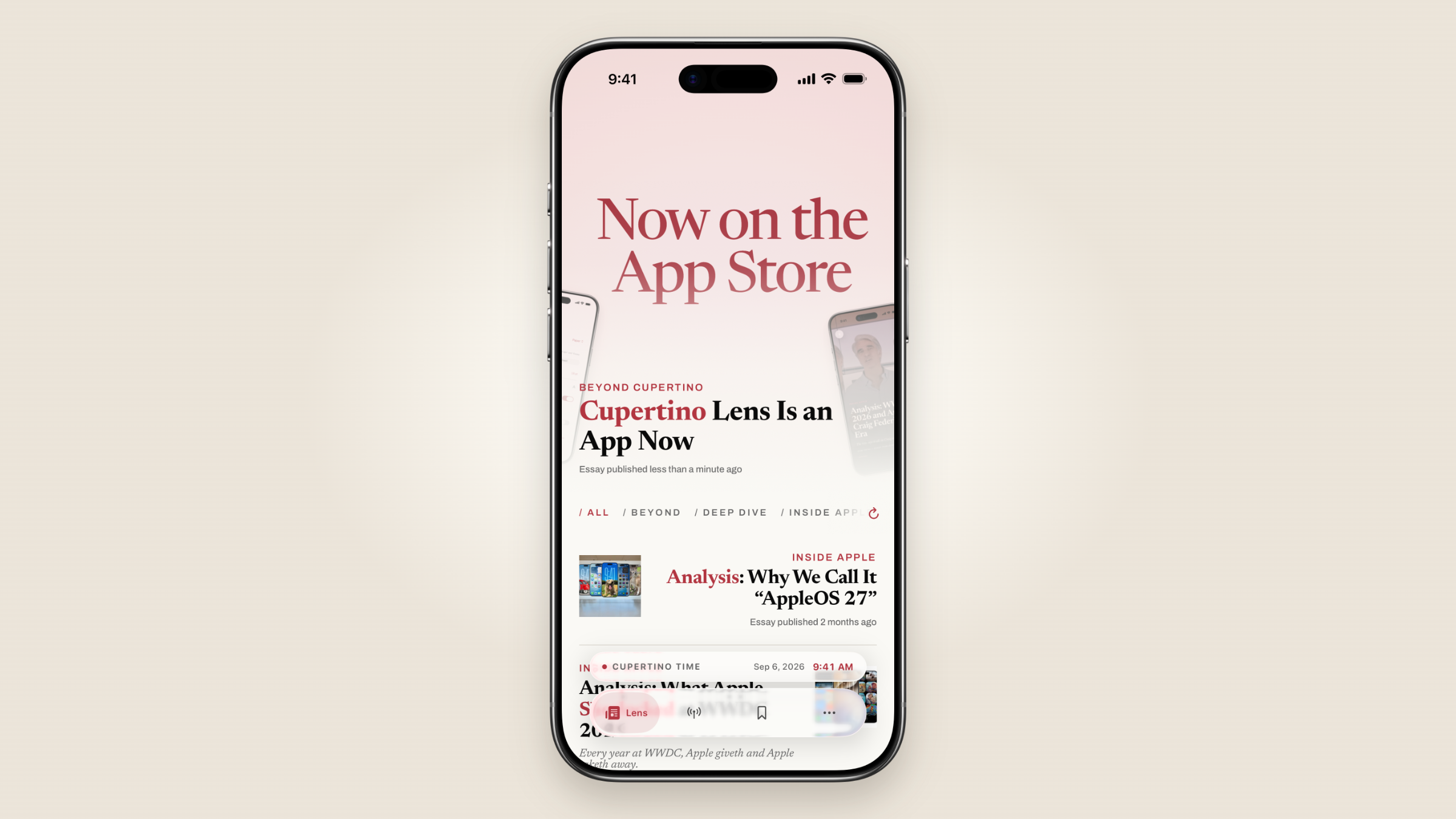
Open it and the lead essay is there with its photograph running the full width of the screen. The sections sit along the top, and you can swipe between them as you would move through a paper. Each has its own lead story and remembers where you left off. Look through another section and come back, and you haven’t lost your place in the first one.
Crimson Red (the new Cupertino Lens brand color) runs through all of it. Sometimes it is just one word in a headline or elsewhere in the UI. The featured photographs carry a light wash of it too. Getting that right took some adjustment: earlier versions drained too much colour out of the photographs and made them muddy. The treatment is lighter now, and if you prefer the original photography, there is a switch in settings to turn it off.
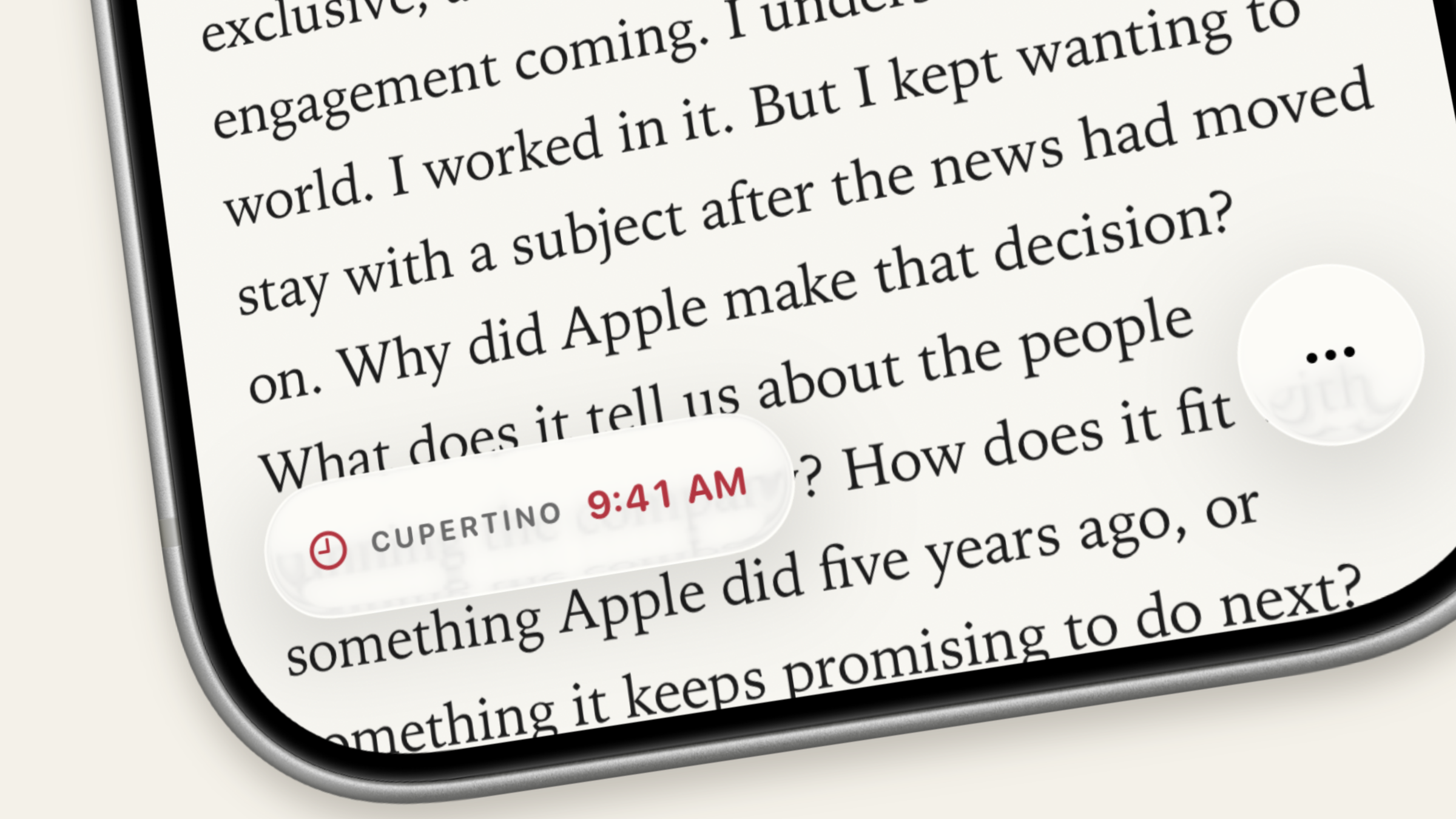
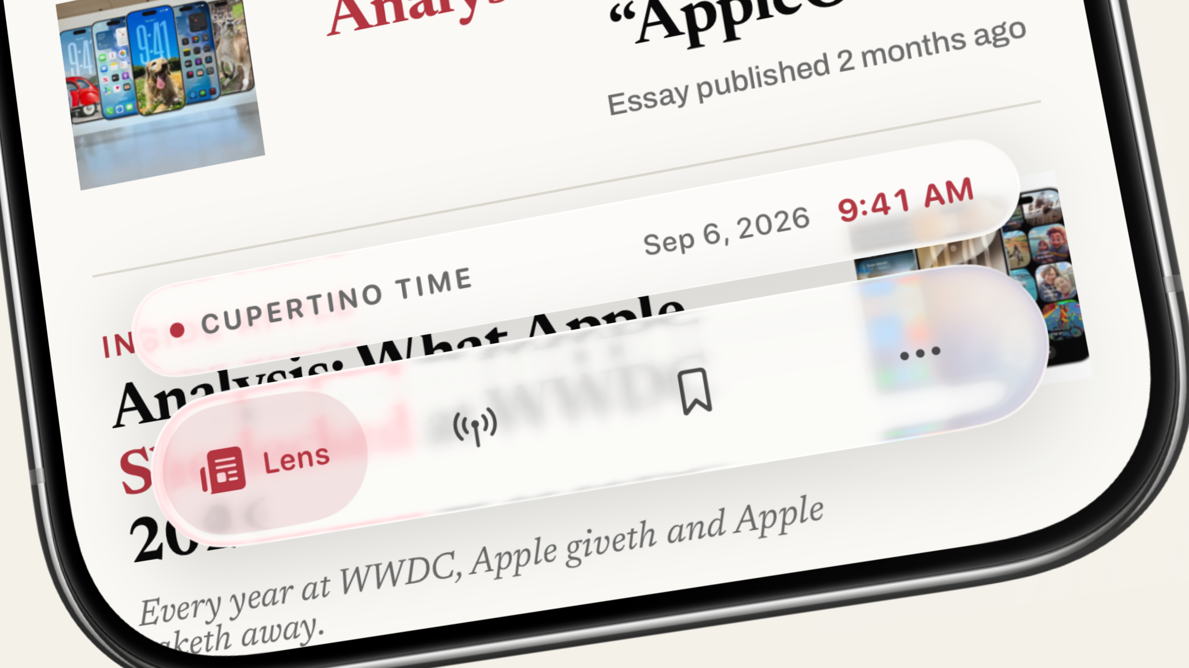
The navigation floats in Liquid Glass, with the current time in Cupertino sitting just above it in a small capsule. Inside an essay, the clock moves to the lower left. On the other side, a small control opens up the actions for saving, sharing, and changing reading modes.
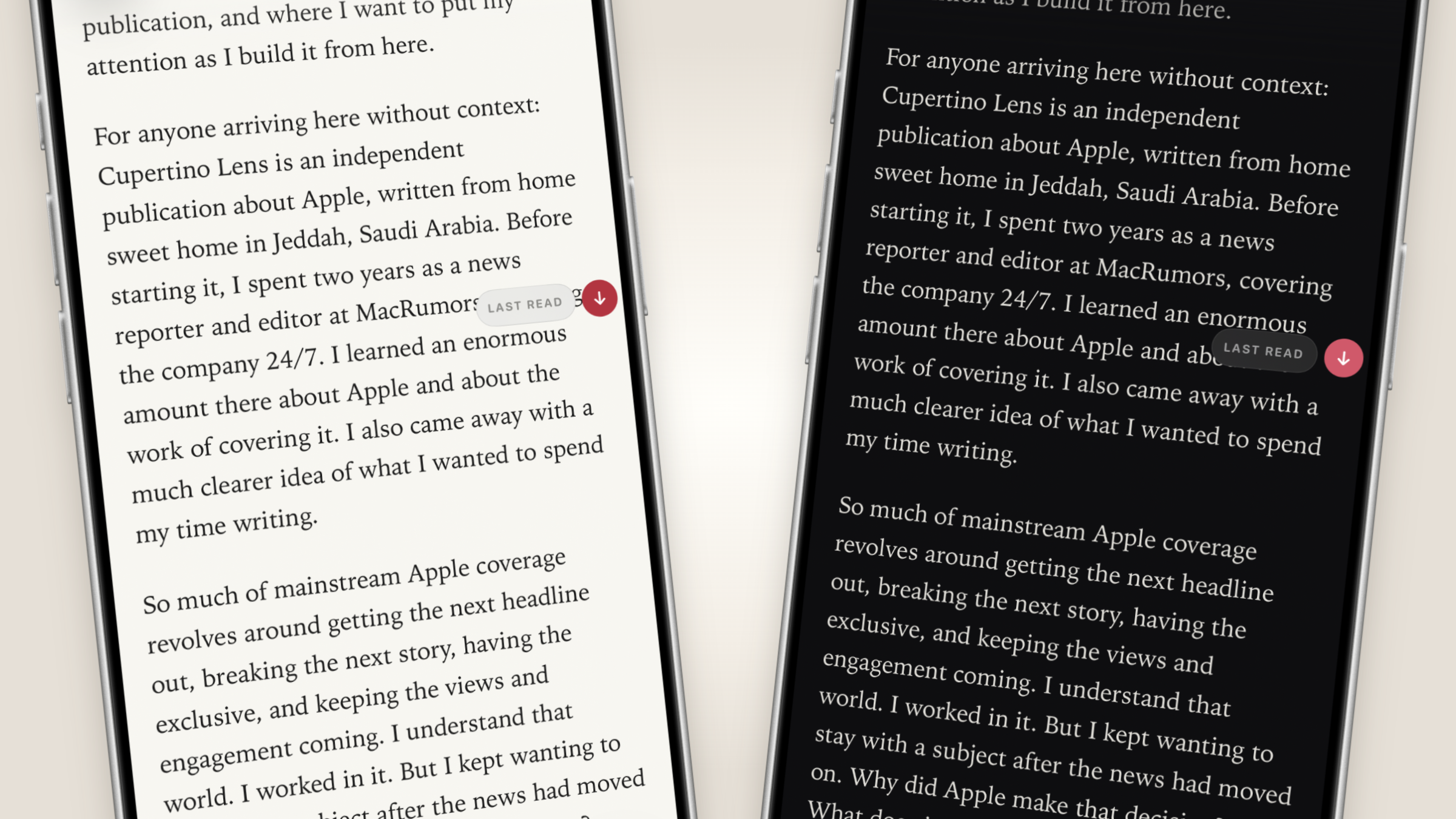
For the page itself, you can choose Paper, a warm off-white, or Ink, a near-black, or let the app follow your iPhone’s light or dark mode setting. You can make the type larger, too. I have my preferences, obviously, but you are the one who has to read several thousand words on it.
The app remembers unfinished essays. A “Last stopped here” entry brings one back into view, and inside the article a “Last Read” marker takes you to where you left off across sessions of the app. Opening the essay still takes you to the beginning. Sometimes I want to remind myself how a piece started before picking it up again, and I wanted that choice to stay with the reader.
Essays also open in Immersive Reader, which is the part I would show you first. The photograph fills the screen, with the headline sitting low in the frame above a crimson rule. Move the phone and the image moves slightly, tilting with it. Start reading, and it gradually darkens beneath the words, until you are well into the essay with the same photograph still behind it.
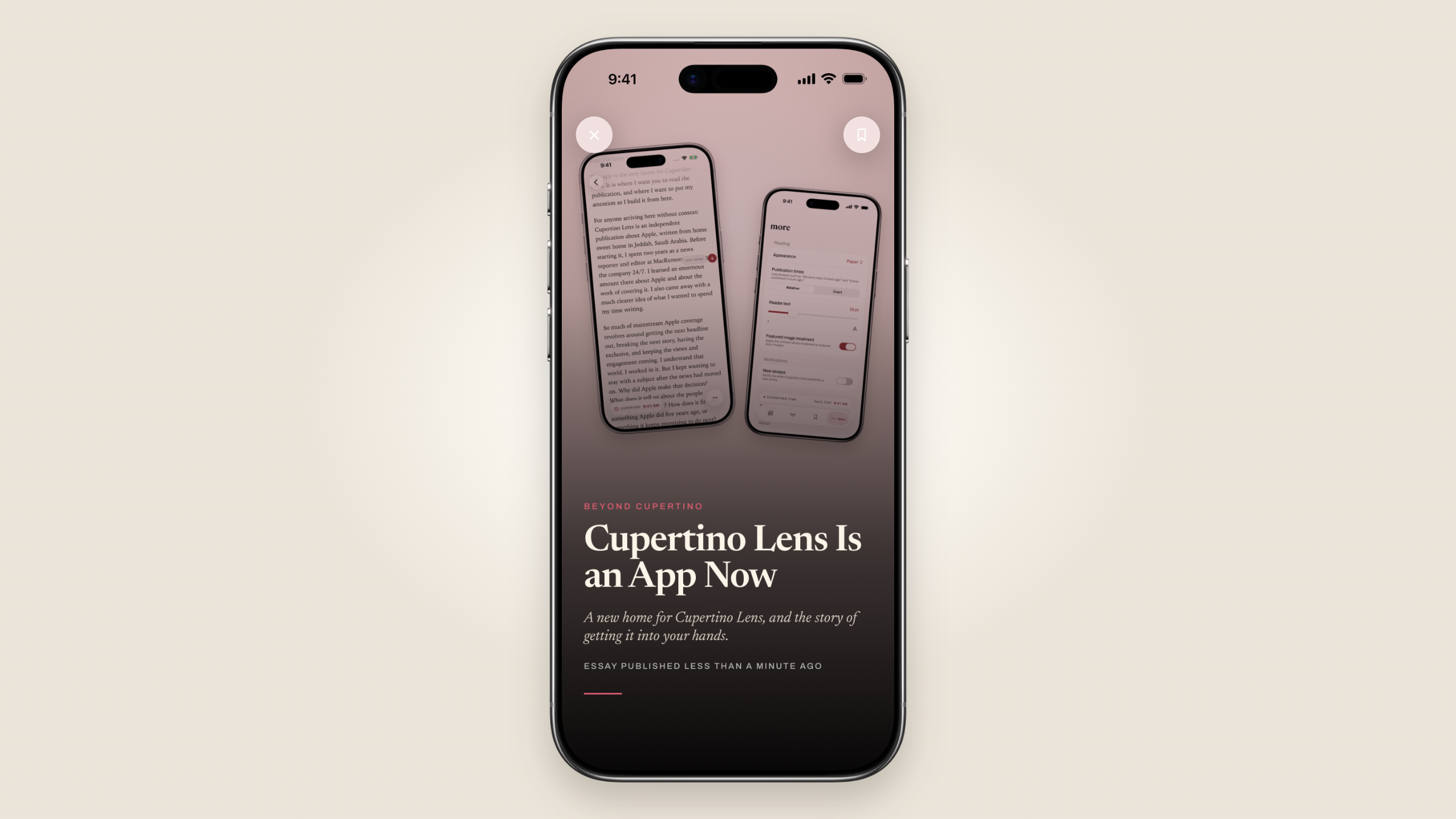
I wanted the image to have a proper opening, then let me get on with reading. And leaving Immersive Reader returns you to the ordinary article where you left it.
The Wire is the other side of the app, and it is where the wider technology press comes in. Call it an RSS feed for Apple news (or any news, for that matter). Headlines, sources, times, and enough of a summary are given to you to work out whether you care. If you do, it hands you to whoever wrote it. You can switch off sources you have no use for and add your own feeds.
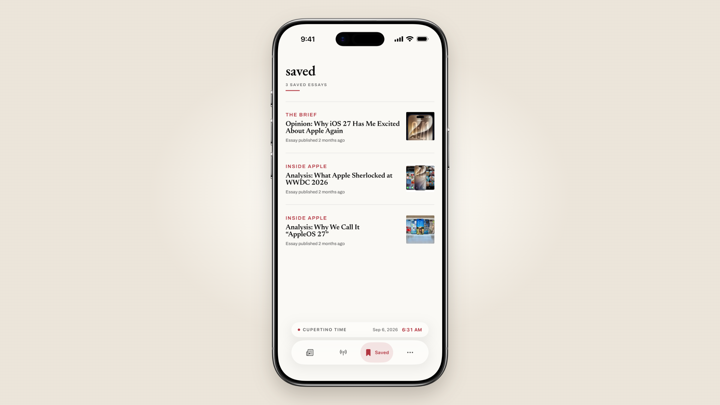
There’s also a saved section if you want to revisit a piece later.
Getting Through App Review
Which brings me to why getting this app into your hands took longer than I expected.
Apple rejected it under Guideline 1.1.6, the rule about false information in the objectionable content section of the App Store Review Guidelines. The finding was that the app contained speculative information about Apple products. I was asked to remove content providing unconfirmed or inaccurate information about them.
The problem, as I kept trying to explain, is that those are two different things. Apple does not generally confirm an unreleased product because a reporter asks it to. That is how the company operates. Reporting on what it may be building still needs evidence, context, and a clear account of what is uncertain. But Apple’s silence does not, by itself, make the reporting false.
I explained this thirteen times. I explained that Cupertino Lens is a publication, that this was an app for reading that publication, and that the App Store already carries news organisations reporting on unannounced Apple products every day. The replies came back courteous, but clearly taken from pre-made app review templates.
So I made two concessions. First, I wrote an individual disclaimer for every post referencing an unannounced Apple product. Apple rejected it. Then I offered to hide that reporting from the app altogether. I was offering readers a version of Cupertino Lens with a substantial part of Cupertino Lens removed from it, just to get through review. Apple rejected that too. Looking back, I am glad it did.
I escalated to the App Review Board. The board found that the 1.1.6 issue was no longer valid and sent the app back into review, where it was approved.
I am also working on the iPad edition, giving the larger screen its own layout, with an app that truly takes advantage of the touch-first experience of an iPad. It’ll be ready very, very soon.
From Jeddah to Cupertino
The latest essay can live on your Home Screen in three widget sizes. There are smaller widgets for the Lock Screen, too. And there is the small crimson one for the date and time in Cupertino.
Side note: I should probably explain why the time in Cupertino keeps turning up. I have never worked there or visited Cupertino. I write from Jeddah, thousands of miles away, about a place I know through what it makes. It can be morning there and evening here, and after a while you stop converting and simply know.
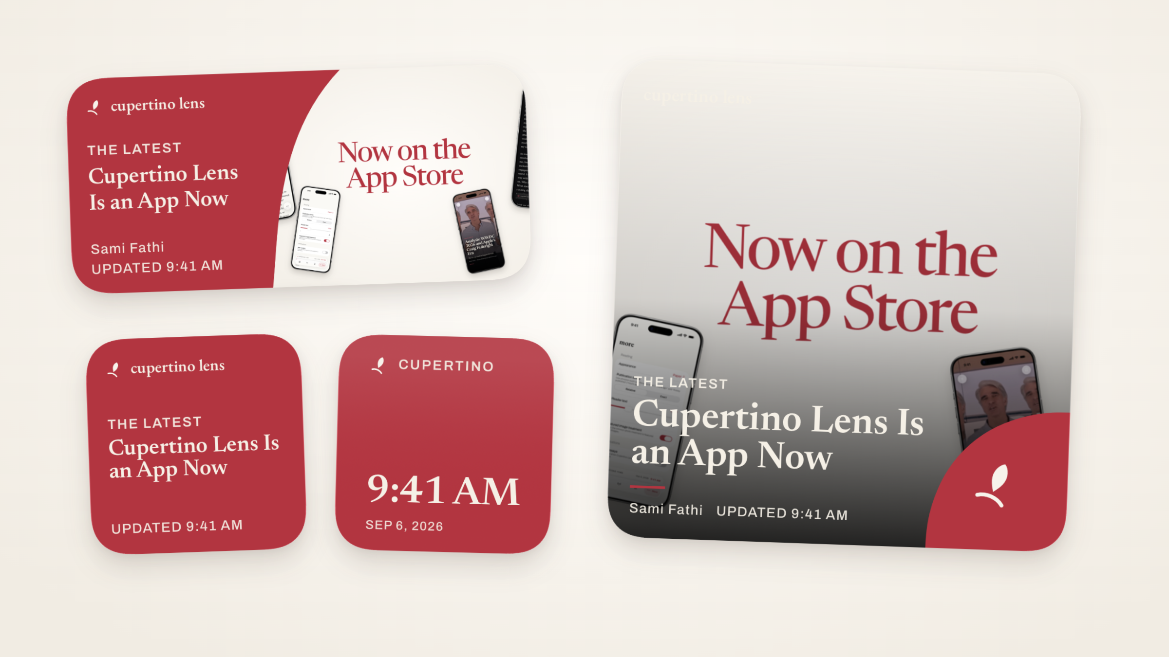
The clock sits on my Home Screen now, beside the app. A small part of Cupertino, here at home. I have spent years writing about the care that goes into Apple’s products. I wanted to put some of that care into the place where you read them.
I hope you’ll download it and make yourself at home.